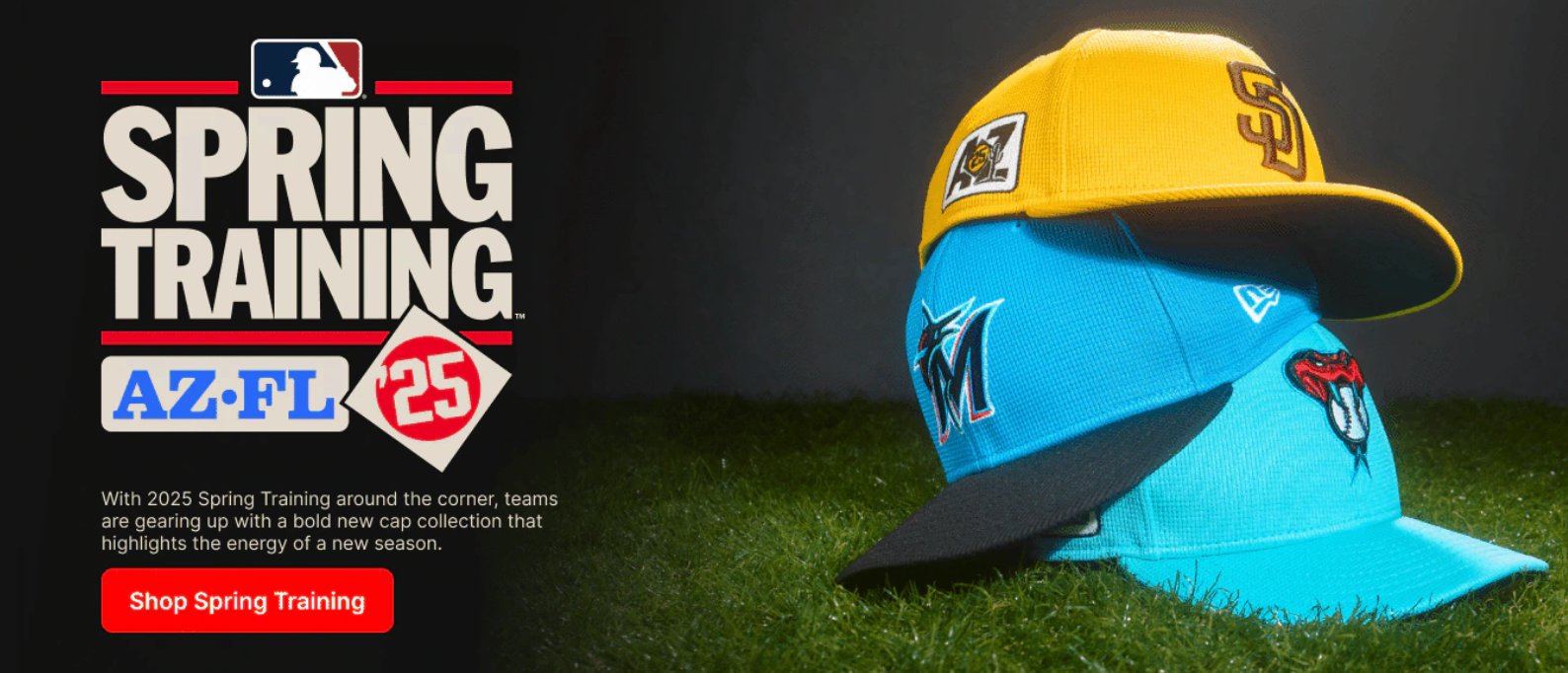
Ranking the 2025 Spring Training Hats: The Best, the Bold, and the Boring
Check out this complete breakdown of the newly released 2025 Spring Training hats! Which teams nailed it, and which ones completely missed the mark? Find out in this engaging and opinionated ranking!
The Ultimate Ranking of 2025 Spring Training Hats
Baseball season is just around the corner, and you know what that means—new Spring Training hats! The 2025 collection has officially been unveiled, and we’re diving into the best (and worst) hats from across the league. Some teams brought creativity and bold color choices, while others decided to play it way too safe. Let’s break it all down in this ultimate ranking!
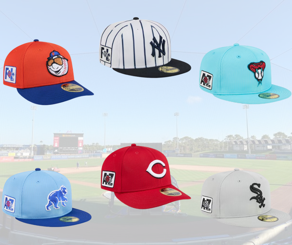
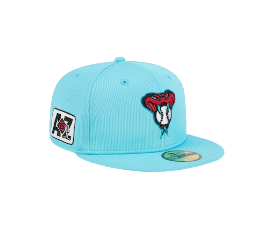
Diamondbacks – Grade: A
The Diamondbacks took the bold route, going all-in on electric teal with a striking contrast of red. The alternate logo choice was a fantastic decision, adding some much-needed fun to the mix. While a black brim would have made this even stronger, the overall execution is solid.
Braves – Grade: A
Sometimes, simplicity is key. The Braves stuck with a tried-and-true red and navy blue color scheme with their classic “A” logo. While the tomahawk logo would have spiced things up, this clean and traditional look works well.

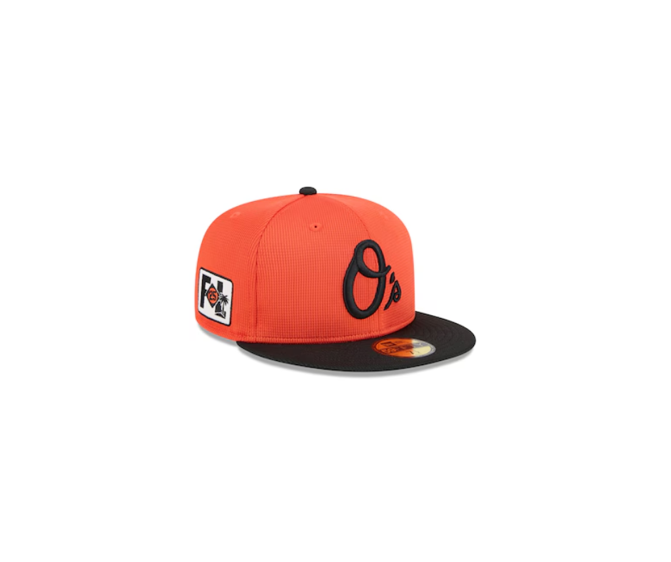
Orioles – Grade: B
Orange and black work well together, and the script “O’s” is a nice touch. However, the hat feels like it’s missing something—maybe a bit of white to make it pop more. A solid entry but not particularly exciting.
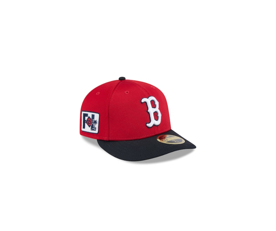
Red Sox – Grade: B
A classic look that gets the job done, but it feels like a missed opportunity. With Spring Training offering a chance to get creative, why not feature the hanging socks logo? Or even something more playful, like WALL-E the Green Monster?
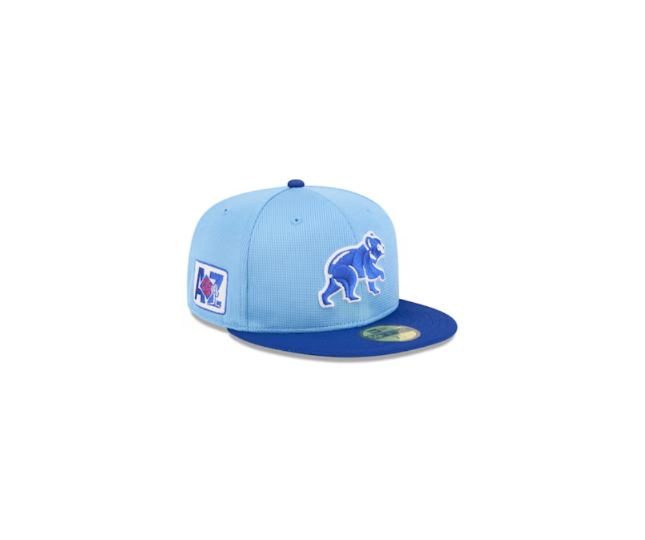
Cubs – Grade: S
This hat is everything you want in a Spring Training design! The light blue and navy combo is beautiful, and the Cubs logo takes center stage. Adding a bit more red would have made it even better, but it’s already a top-tier choice.
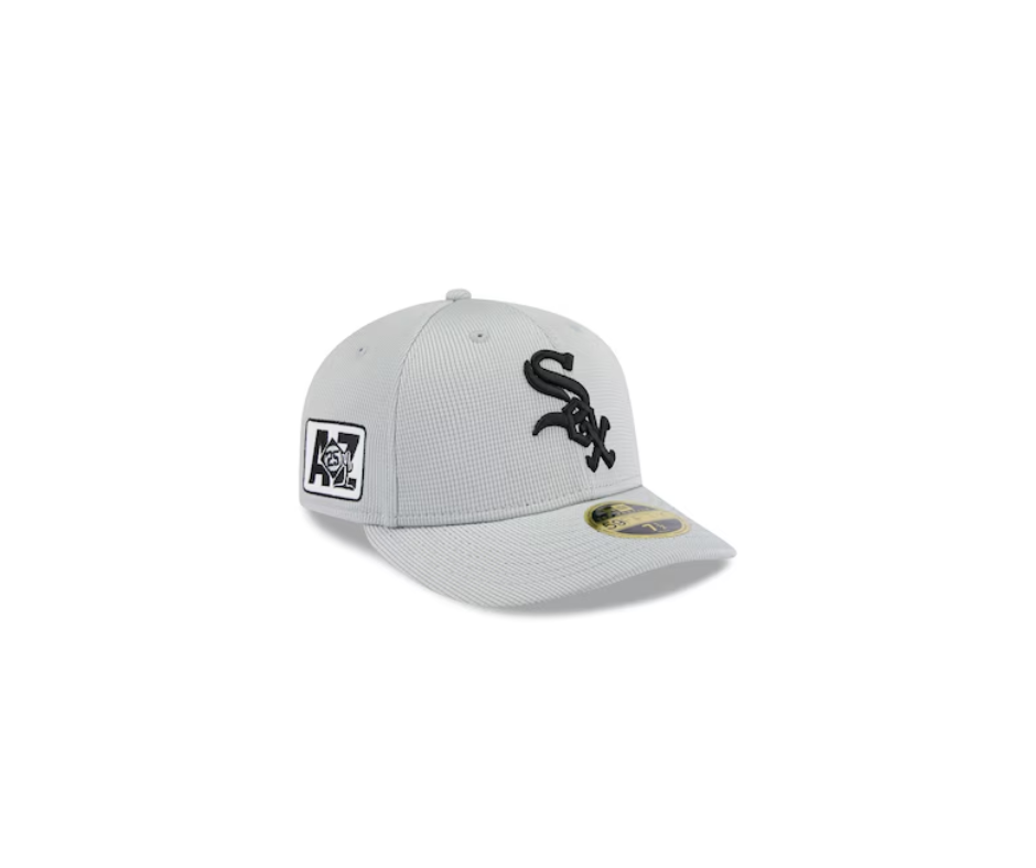
White Sox – Grade: A
The light gray is a fresh take, but the overall design lacks heart. A throwback logo or retro color scheme could have elevated this for a more dynamic look.
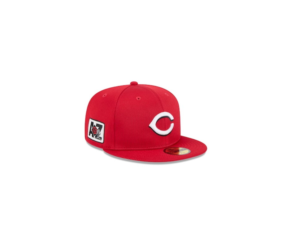
Reds – Grade: D
This feels way too much like their regular season hat. It’s bright, but it lacks creativity. A black brim or a different logo could have helped shake things up.
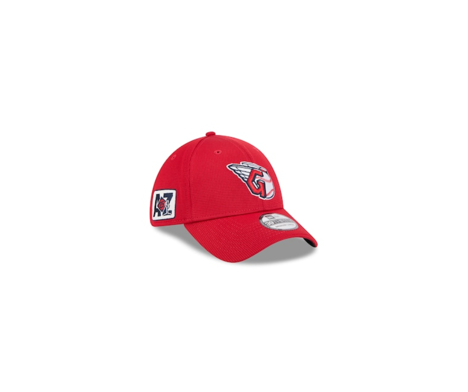
Guardians – Grade: C
Props for avoiding the typical “C” logo and going with an alternate emblem. The red is great for Spring Training, but a two-tone color scheme would have made it stand out more.
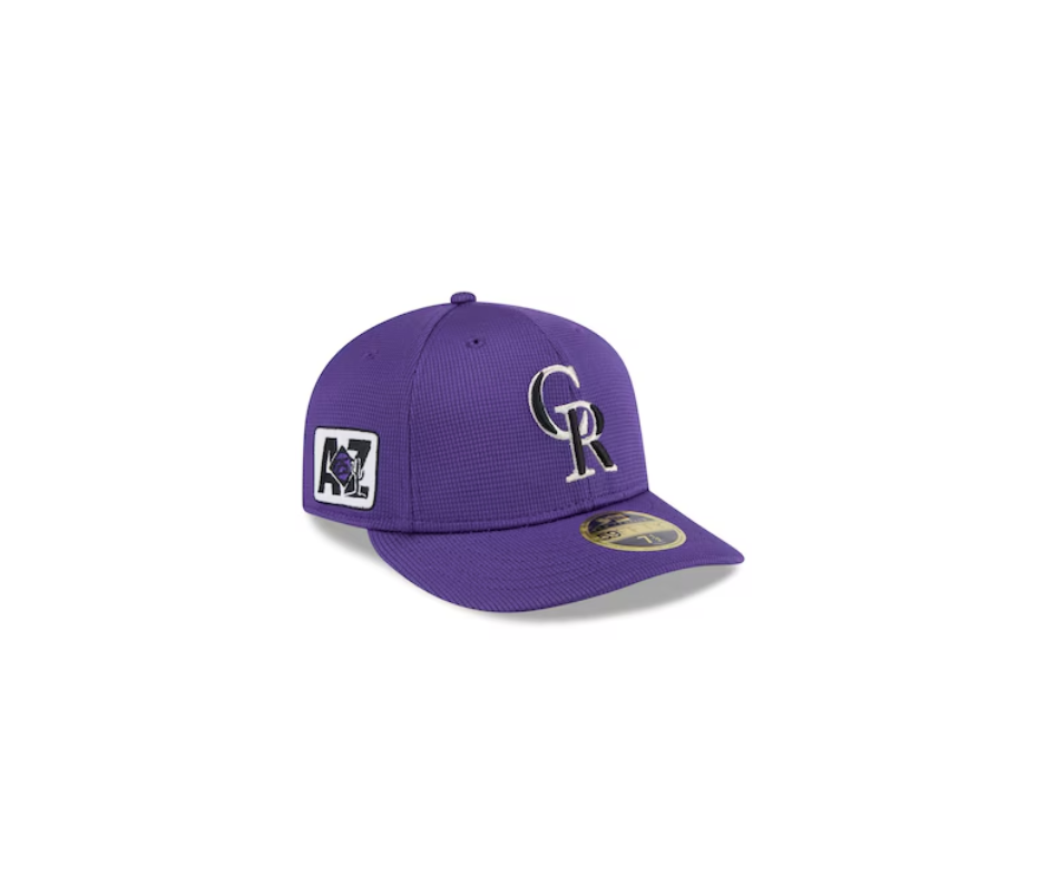
Rockies – Grade: D
A wasted opportunity. Purple is a fantastic color, but the logo is uninspired. A mountain logo or some silver detailing would have been a much better choice.
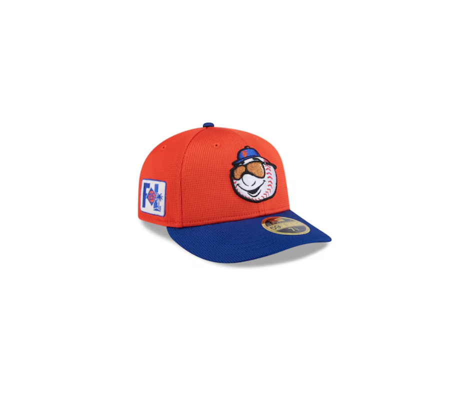
Mets – Grade: S (Best of the Best!)
Mr. Met wearing sunglasses? Perfection! The orange and blue blend beautifully, making this the ultimate Spring Training hat of 2025.
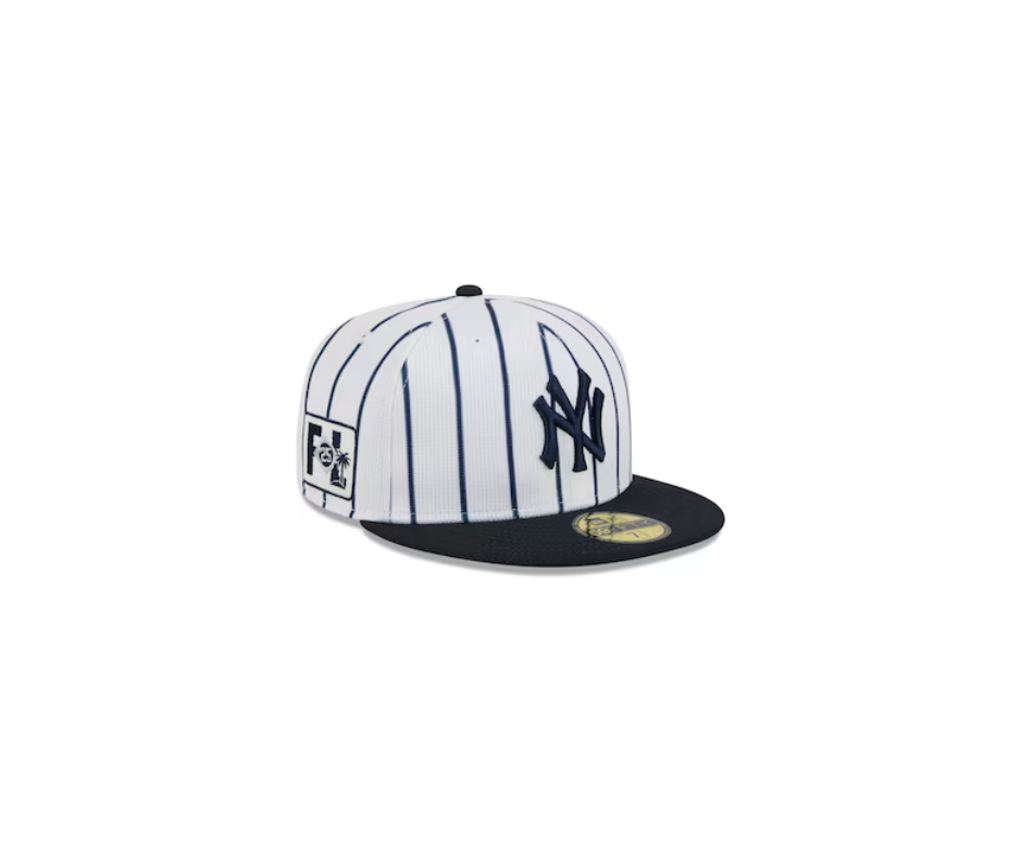
Yankees – Grade: S
Even as a Mets fan, I have to admit this hat is fantastic. The pinstripe detail is unique, and the clean white design looks amazing for Spring Training.
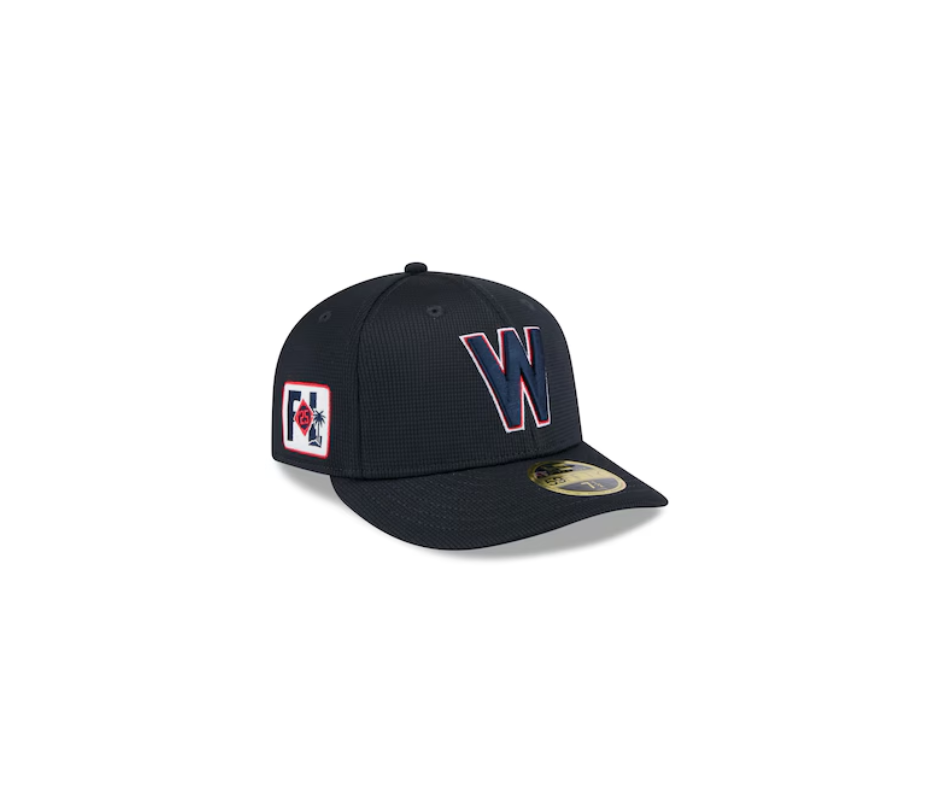
Nationals – Grade: F
What even is this? A dark hat with barely visible detailing isn’t ideal for spring. This one is a complete miss.
Final Thoughts:
The 2025 Spring Training hats brought a mix of creativity and missed opportunities. Some teams brought their A-game, while others seemingly just went through the motions. What do you think? Would you rank these differently? Let us know in the comments!
What About Your Team?
Did your favorite team make the cut? If not, don’t worry – we’ve got you covered! Click below to check out other teams' Spring Training hats and decide where your team ranks!